Sitecore JavaScript Services – custom image srcSet
Reading time: 3 min
This post will be short, but I’m pretty sure it will be very helpful!
By default JSS supports srcSets for an image, the srcSet is passed as follows:
<img alt="Sitecore JSS Logo" sizes="(min-width: 960px) 300px, 100px" class="img-fluid" srcset="/data/media/img/jss_logo.png?mw=300 300w, /data/media/img/jss_logo.png?mw=100 100w">
Pretty simple. The srcset attribute lets you specify the image size for each viewport you want to support.
You will notice that it is always the same image source, just rendered in different sizes.
In practice, an image may look perfect in landscape mode on a desktop device, but fit much better in portrait mode on a mobile device. In the worst case, you should have a separate image source for each viewport.
This is not easily possible in JSS!
After searching a bit on the internet, I found this useful documentation: Responsive images | MDN
Lots of stuff to read… ????
But there is one area that has piqued my interest:
ART DIRECTION
To recap, the art direction problem involves wanting to change the image displayed to suit different image display sizes. For example, a web page includes a large landscape shot with a person in the middle when viewed on a desktop browser. When viewed on a mobile browser, that same image is shrunk down, making the person in the image very small and hard to see. It would probably be better to show a smaller, portrait image on mobile, which zooms in on the person. The“picture” element allows us to implement just this kind of solution.
Like “video” and “audio”, the “image” element is a wrapper that contains several “source” elements that give the browser different sources to choose from, followed by the all-important “img” element.
Hey! That is exactly what I want to achieve!
It’s now pretty easy to render Sitecore image fields for any viewport in a srcSet like this. In my case, I’m working in an Angular JSS app, so the idea was to extract this as an easy-to-use component.
The model for the component looks like this:
import { ImageField } from "@sitecore-jss/sitecore-jss-angular";

export interface ResponsiveImageModel {
    Smartphone: ImageField;
    Tablet: ImageField;
    Laptop: ImageField;
    Desktop: ImageField;
}
I put a little more logic behind it to at least get an alternative text, but that’s not relevant here.
export class ResponsiveImageComponent implements OnInit {

  @Input()
  model: ResponsiveImageModel;

  smartphoneImageSrc: string;
  tabletImageSrc: string;
  laptopImageSrc: string;
  desktopImageSrc: string;
  defaultImageSrc: string;
  defaultImageAlternateText: string;

  ngOnInit() {
    this.setImageSources();
  }
  ...
}
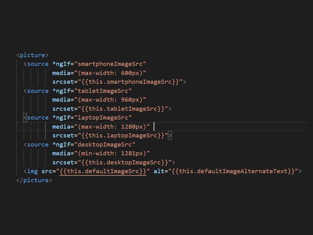
The output is very simple:
<picture>
  <source *ngIf="smartphoneImageSrc" media="(max-width: 600px)" srcset="{{this.smartphoneImageSrc}}">
  <source *ngIf="tabletImageSrc" media="(max-width: 960px)" srcset="{{this.tabletImageSrc}}">
  <source *ngIf="laptopImageSrc" media="(max-width: 1280px)" srcset="{{this.laptopImageSrc}}">
  <source *ngIf="desktopImageSrc" media="(min-width: 1281px)" srcset="{{this.desktopImageSrc}}">
  <img src="{{this.defaultImageSrc}}" alt="{{this.defaultImageAlternateText}}">
</picture>
If you think that the browser renders four images, you are wrong, it does not. The browser reloads the corresponding image when you scale the browser window, but if you are on a mobile device or tablet, only one image is loaded.
That’s it, have fun!
Best regards,
Dirk
Do you need Sitecore support? – No problem for our Sitecore experts!